
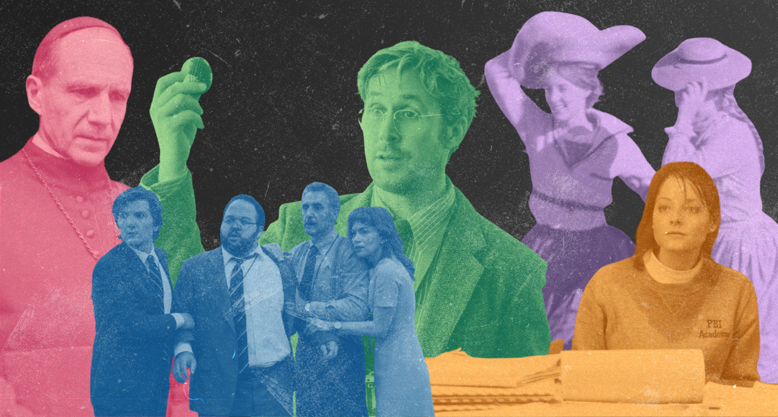
I just love movies and TV shows.
Anybody who knows me knows this. Growing up in a movie-watching family, I watched everything from The Truman Show and the original Tobey Maguire Spider-Man and ate it all up equally. When I saw The Secret Life of Walter Mitty in 2013, I remember leaving the theater saying, “I had no idea a movie could look that beautiful.”
That movie is my cited launching pad that led me to pursue filmmaking. In high school, I corralled all my friends to create short films. We were always making something. I loved learning how to do it all — writing, directing, lighting, editing — but if I had to choose a favorite part it was always how it looked. Setting up a shot to look just right was a driver of mine throughout high school and college, where I officially studied digital media production.
Now, as a graphic designer and creative director, I am somewhat distanced professionally from my original love of film and television production, which I occasionally mourn. I’m an AMC A-list member to compensate (at ease, soldier). Jokes aside, I know that love will always be a big part of my artistic influence and personal identity, no matter what medium I’m working in.
Which brings me to this page in my portfolio: designs inspired by movies and TV shows. It’s as simple as that — the following designs represent some of my favorite pieces of media, and some that just have good quotes. Heartbreak feels good in a place like this.
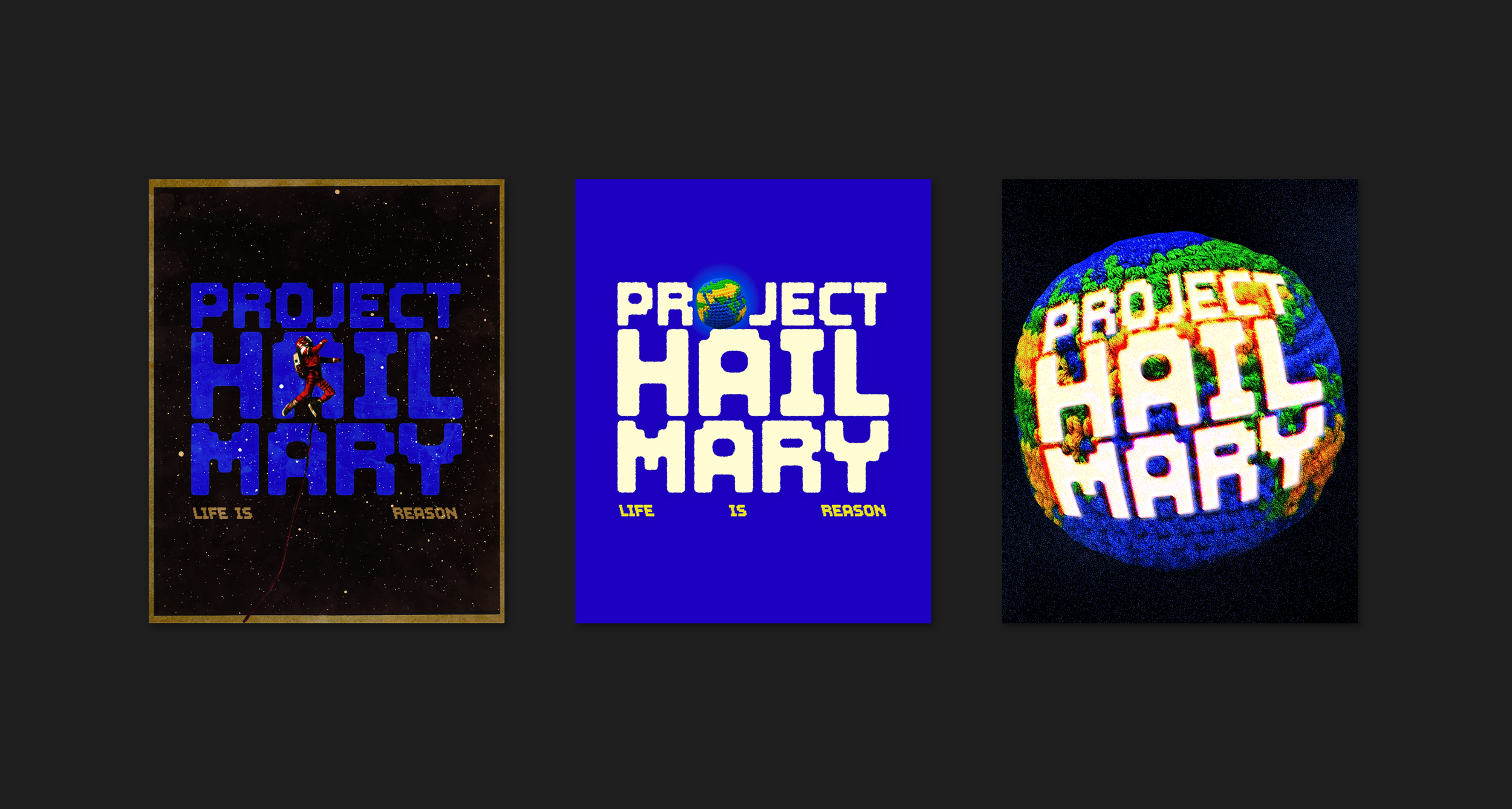
Project Hail Mary, 2026
If I had a nickel for every time a movie has made me cry about a rock, I’d have two nickels. Which isn’t a lot, but it’s weird that it’s happened twice. (Yes, that like 2 minute scene in Everything, Everywhere, All At Once broke me.)
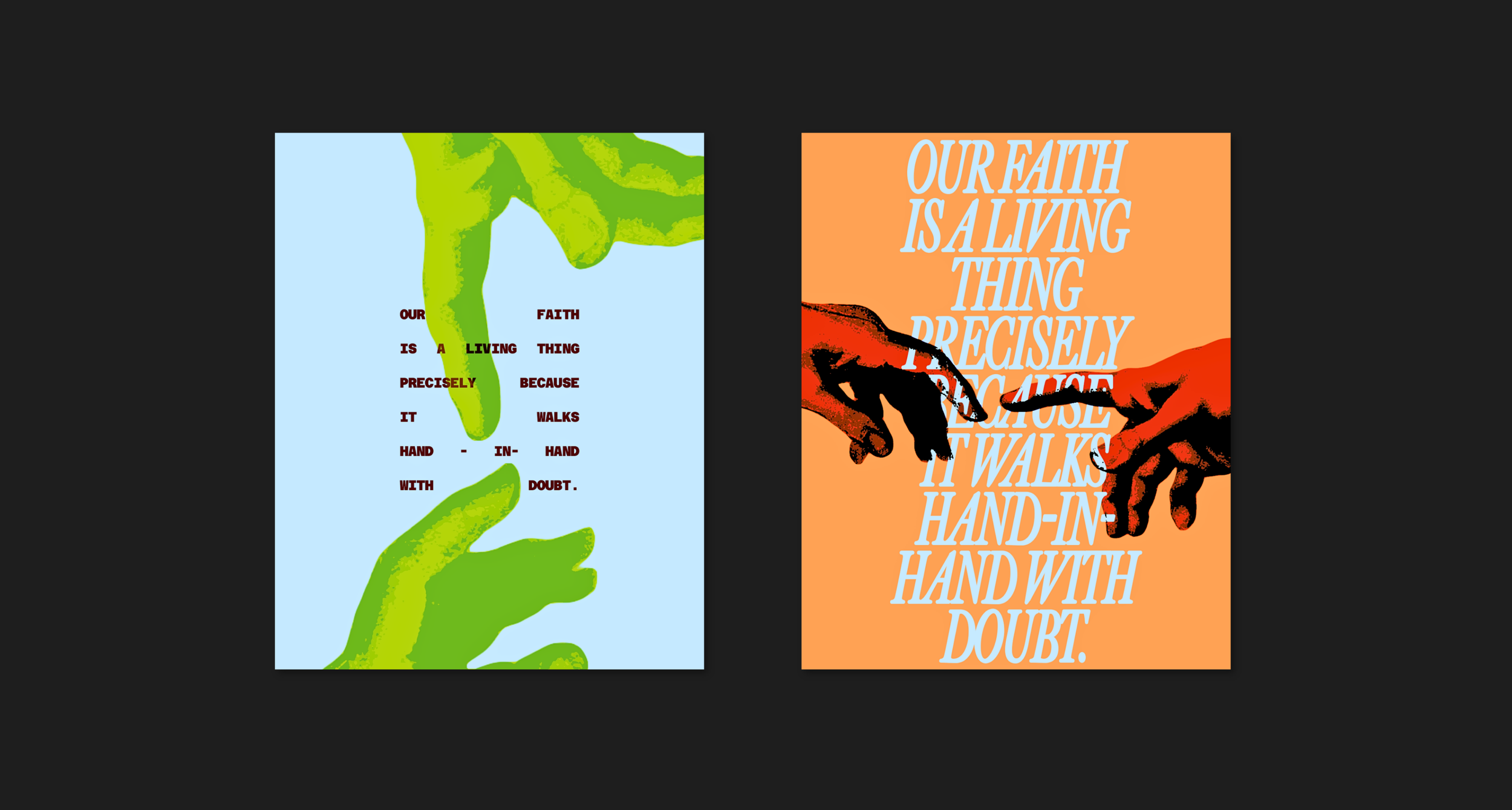
Conclave, 2024
Who doesn’t want to watch 2 hours of Catholic drama? A movie full of poping — sorry, piping — hot gossip that’s as intricate as the medieval artwork in the backgrounds. The layered story challenges its audience to wrestle Jacob-style with themes of choice, divinity, and carved-in-tablet ancient systems: just because you Vatican doesn’t mean you Vatishould.
I have the design on the right hanging in my living room, it’s a personal favorite of mine.
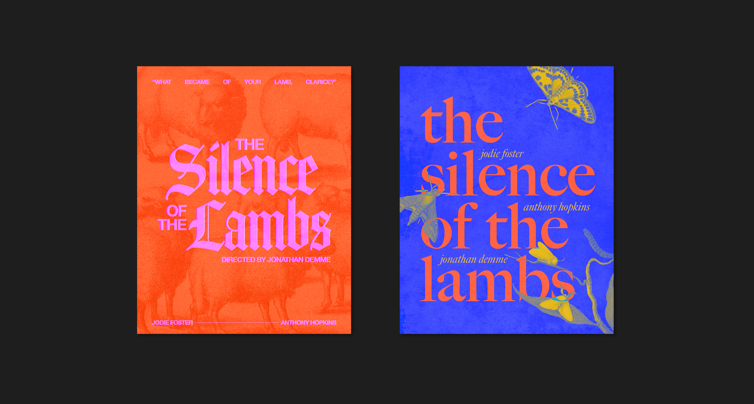
The Silence of the Lambs, 1991
A horror movie about being a woman!
Stylized poster style on the left, book cover vibes on the right.
I wanted to capture the dizzying, disorienting, invasive atmosphere of the film, especially the final 20 minutes. Bright, neon colors add an unexpected saturation to a famously dreary and dark movie; I chose this palette after reading the book it was based on and finding the inner world understanding of Clarice Starling to have a bit more vibrancy than the movie was able to show through dialogue and staging.
Letterboxd top 4 movie. Clarice rules. 10/10 hawkmoths.
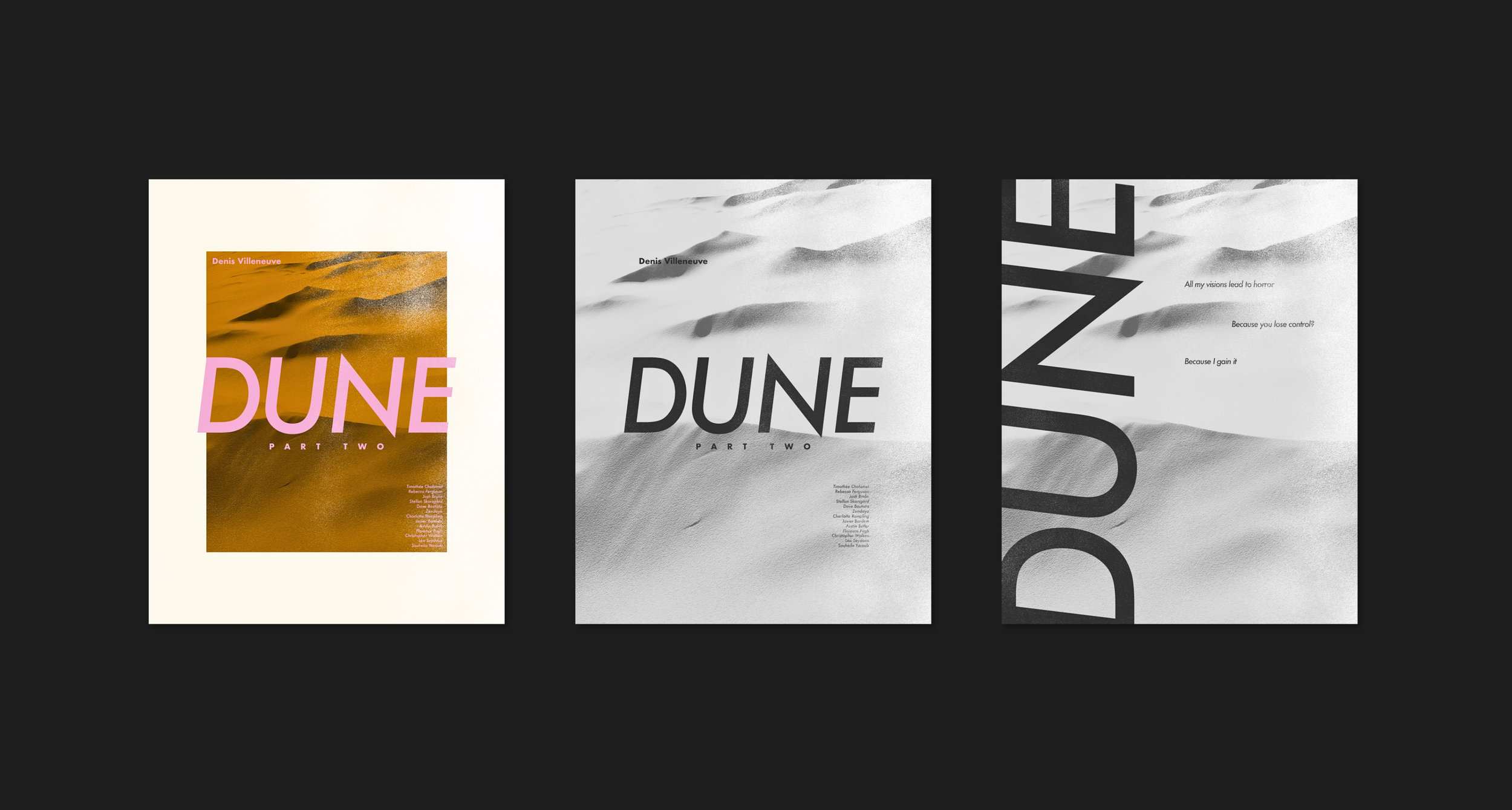
Dune Part Two, 2024
LISAN AL-GAIB 📢
Poster style, pink type because I said so. Gritty texture layers. You can’t see it, but there’s a LARGE worm under that sand so watch out.
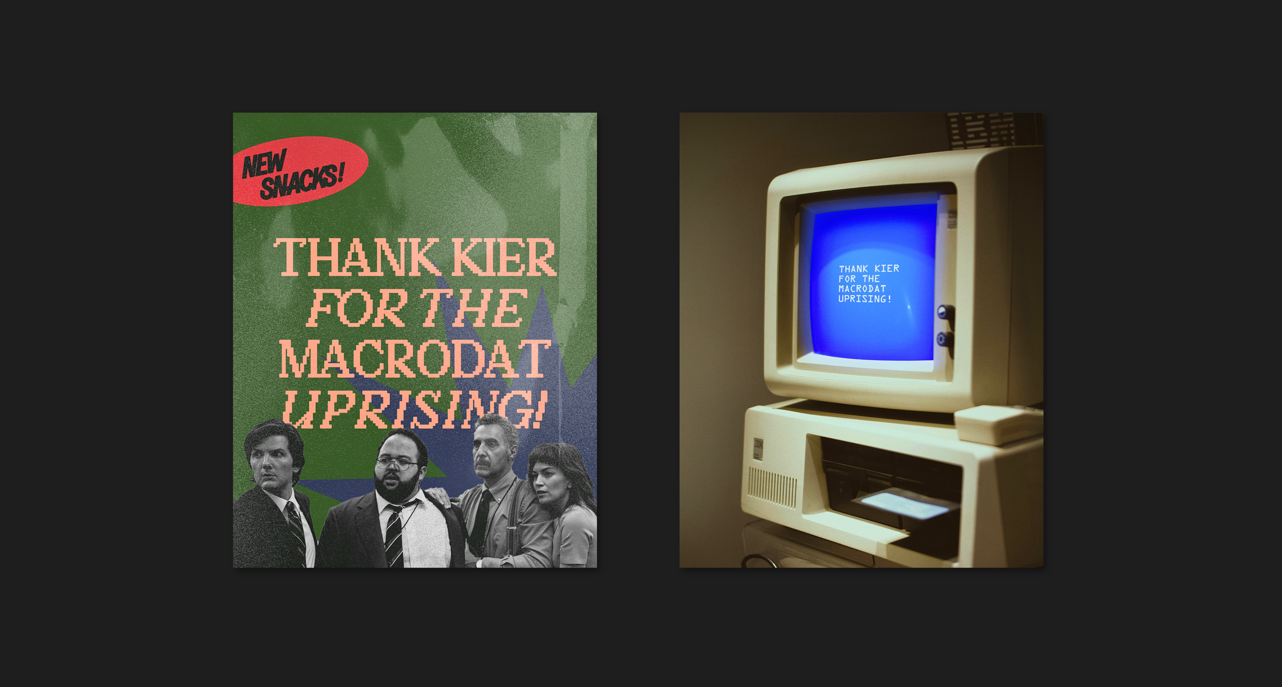
Severance, 2022
Mystery-box show centered around one of my favorite tropes: the concept initially being “not that bad” until you think of The Implications.
The show itself clearly loves design and designers, which is one of the many reasons I’m so drawn to it. It’s well-written, darkly hilarious, tremendous in its detailed world-building, and follows through on the aforementioned Implications in such a satisfying and compelling way. Plus, it was executive produced and directed by Ben Stiller, who starred in and directed The Secret Life of Walter Mitty. So, in a way, I was destined to love it.
The lefthand design is an ode to the off-putting, familiar yet icy in its precision, mid-mod packaging that frequently appears on the screen. Specifically, the snack machine. There’s something so wrong and evil and funny about that snack machine.
The design on the right has a cobalt “Blue Screen of Death” color as the focal point, a hallmark of the corporate hellscape branding of Lumon that haunts the series. Old school computer follows that same humdrum, empty, endless, liminal atmosphere of the severed floor.
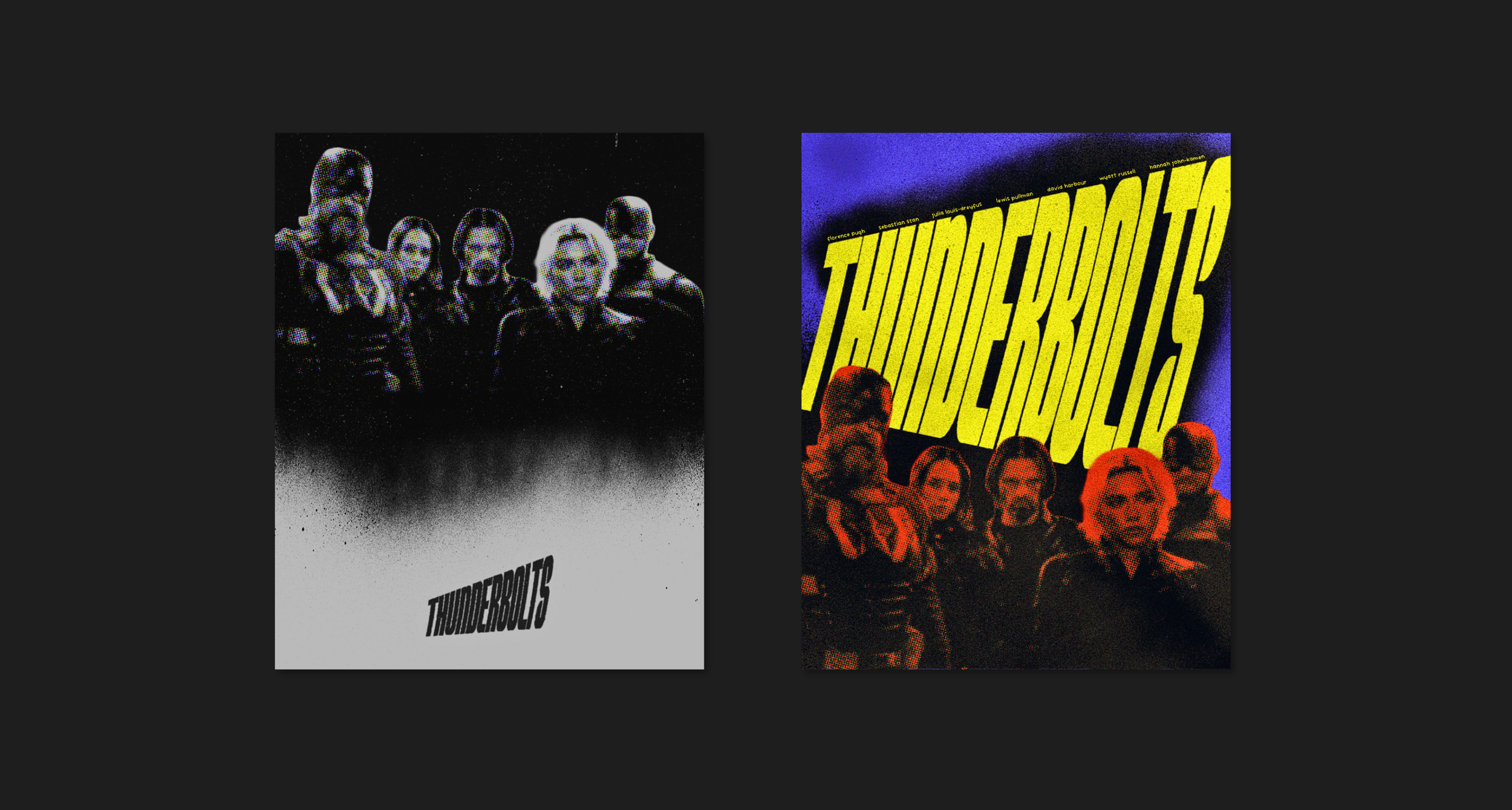
Thunderbolts, 2025
In case you’re at risk of thinking I’m cool, here’s some superhero movie posters.
Marvel has fallen a bit, overextending itself and departing from its original appeal. Also, I’m 29 now. Probably a mixed bag of reasons why these films no longer consistently hit the way they used to.
That’s why I was so happy to thoroughly enjoy Thunderbolts. I walked into the theater skeptical, but was overall really happy with what felt like a return to form for the superhero movie. Stupidly obvious jokes, interesting character developments, rag-tag team dynamics, and some genuinely compelling stakes that I haven’t encountered in these types of stories for a while.
This was a simple, fun poster design. I included halftone overlays to give it the classic comic-book look, and added heavy texture effects to pull some of the grit of the story into the visuals.
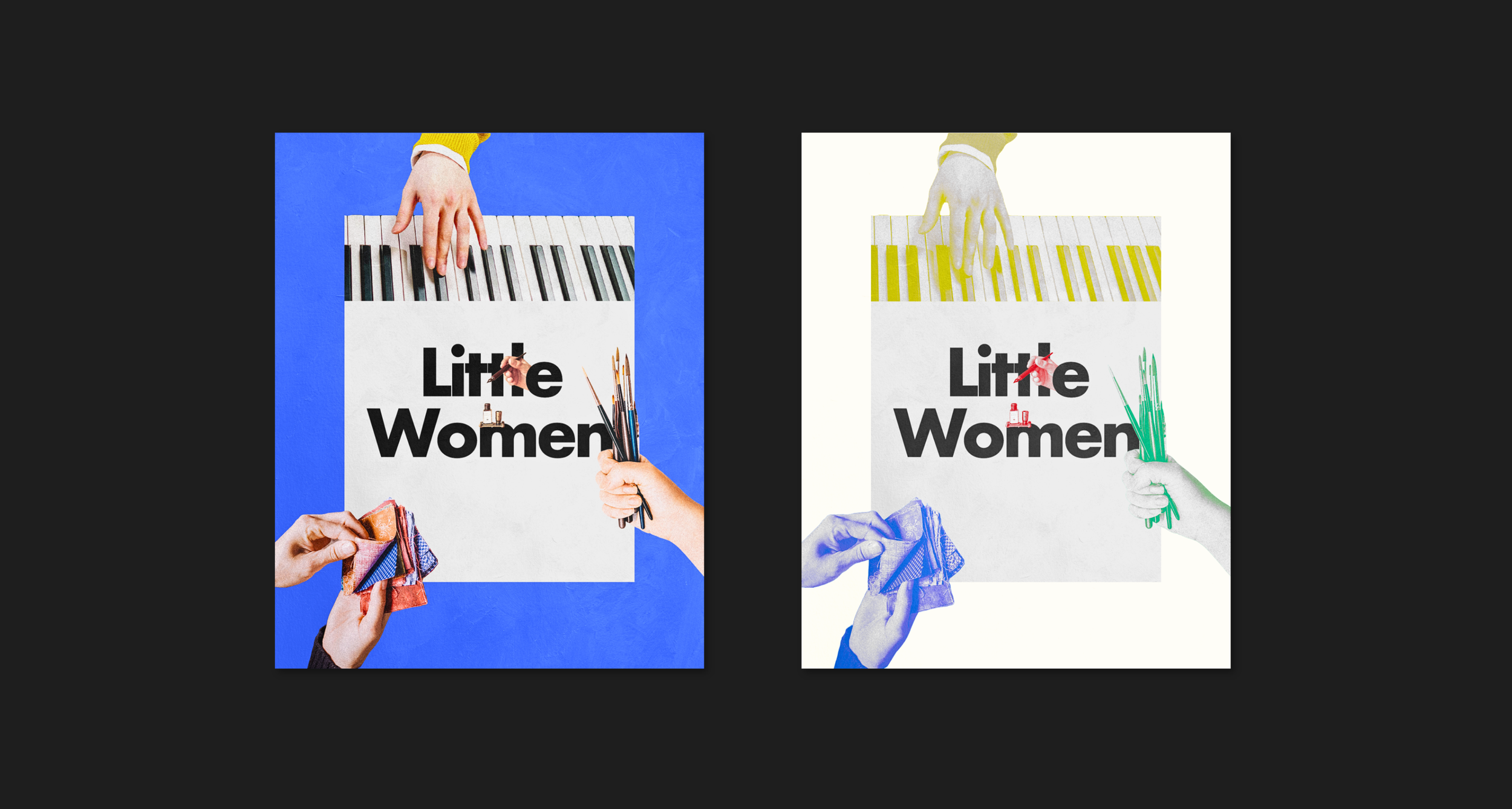
Little Women, 2019
One of my all-time favorite stories. I love every iteration of it — book, play, musical, movies, limited series. Greta Gerwig’s 2019 film version resonates with me in a special way. The nonlinear timeline pulls threads together thematically that I wouldn’t connect otherwise, and the further fleshing out of all the March sisters, rather than just Jo, is so beautiful and humanizing.
I chose to represent each sister as her core talent / passion. These are simple, collage-style posters. This was an early design of mine. As I have continued to do mixed media work, it’s fun to see how I’ve developed from simpler layouts like this.
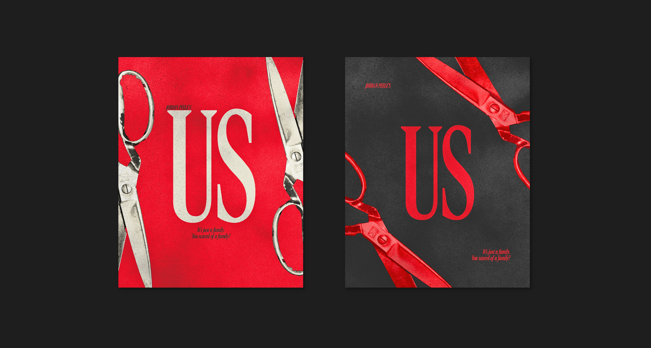
Us, 2019
Truthfully, my least favorite Jordan Peele movie. My first watch of it happened to fall within a month that I was doing a design-a-day challenge, so I decided to try my hand at a poster. Still, saying it’s my least favorite Peele movie is like saying a meal is my least favorite Michelin Star experience. I love his movies and he needs to make another one immediately.
Red, black, and silvery white were my palette choices because they are directly correlated to the key colors within the movie and the original theatrical poster. Scissors because iykyk.