
The Process
This was my third year designing for the CarePortal Conference — an annual 3-day gathering for churches, child welfare agencies, and anybody looking to engage with creative solutions for family strengthening within their communities.
The goal of conference branding is to build from the base of the CarePortal brand itself. The experience of the conference should look & feel familiar; attendees should be able to step into the space and immediately recognize key elements of CarePortal branding. However, it should also still feel like it’s own thing, a special event that emphasizes the particular themes we want to highlight.
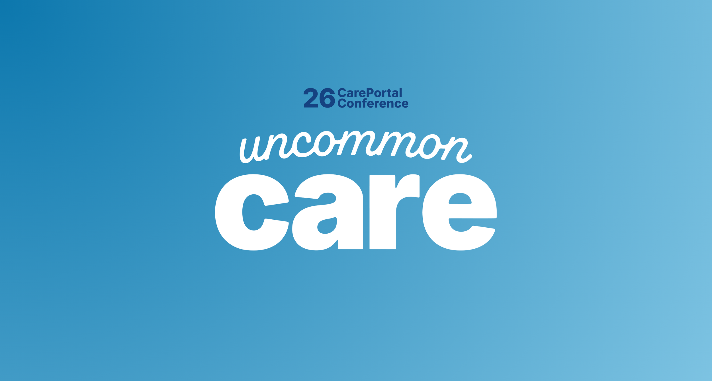
In conversations with leadership and data from previous attendee insights, the theme Uncommon Care was born. The evolution of this theme landed on a simple, strong visual core:
Softened text elements customized from the brand’s typefaces (Inter, Alkaline)
Palette blues combined into abstract gradients that convey a sense of calm, clarity, and connection
From this branding, I built all digital and print assets for the conference, interfacing with local printers to ensure signage and heavy-lift assets (like the program) were exactly what we needed. This process in total spanned about 10 months and was incredibly fulfilling to see it come to life. Check out the images below to see some examples!
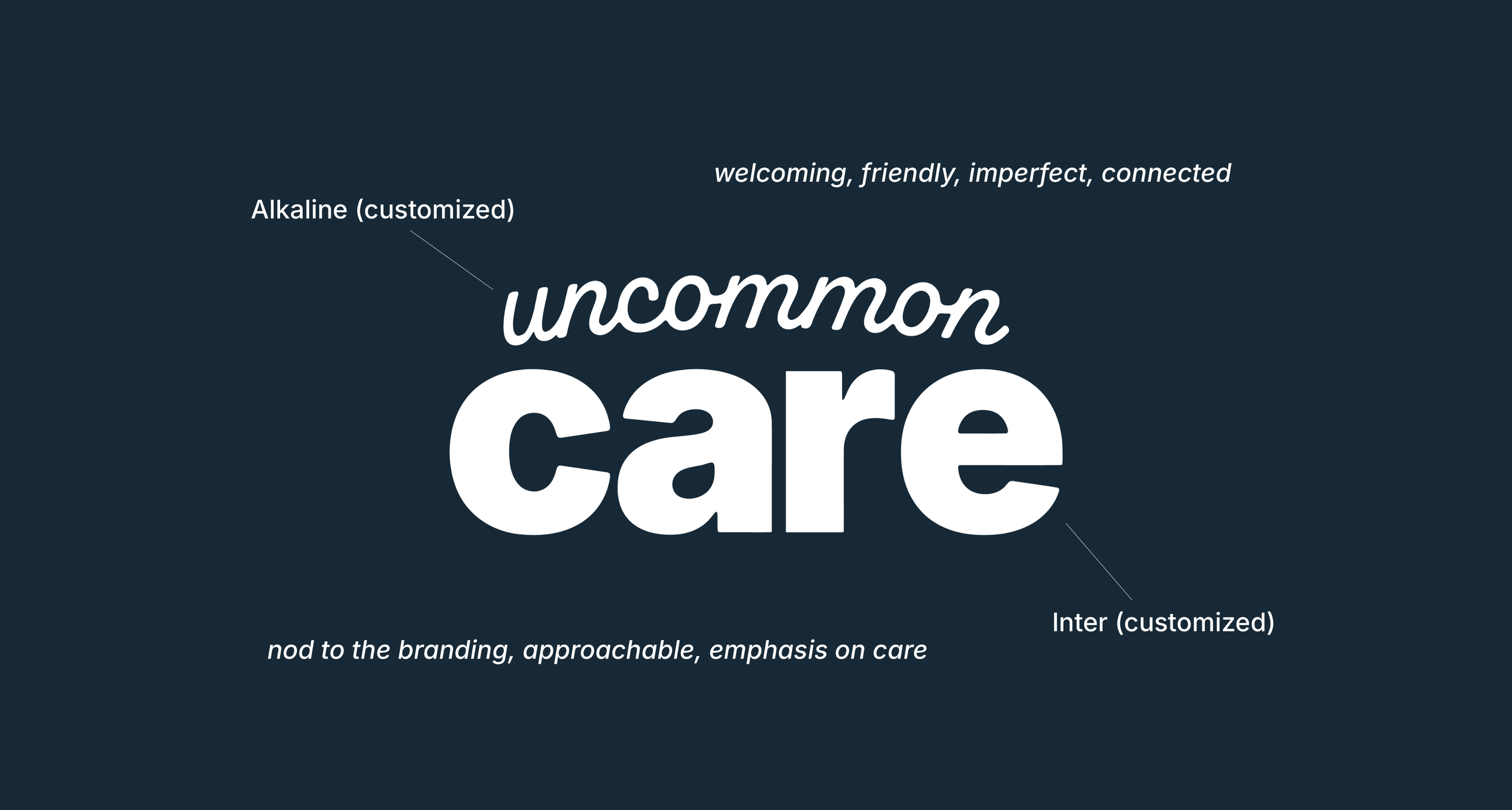
Core brand mark development.
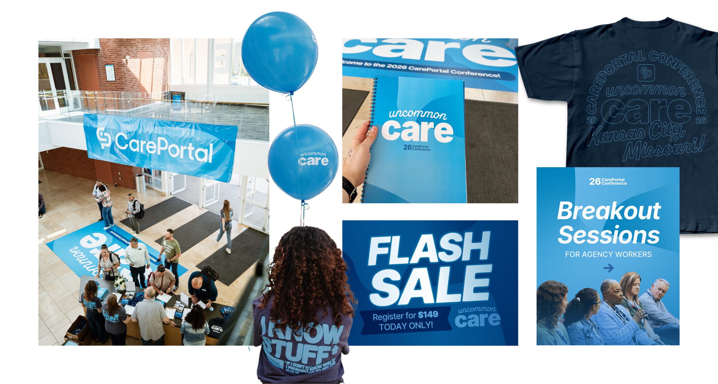
Print, apparel, decor, and digital branded elements.
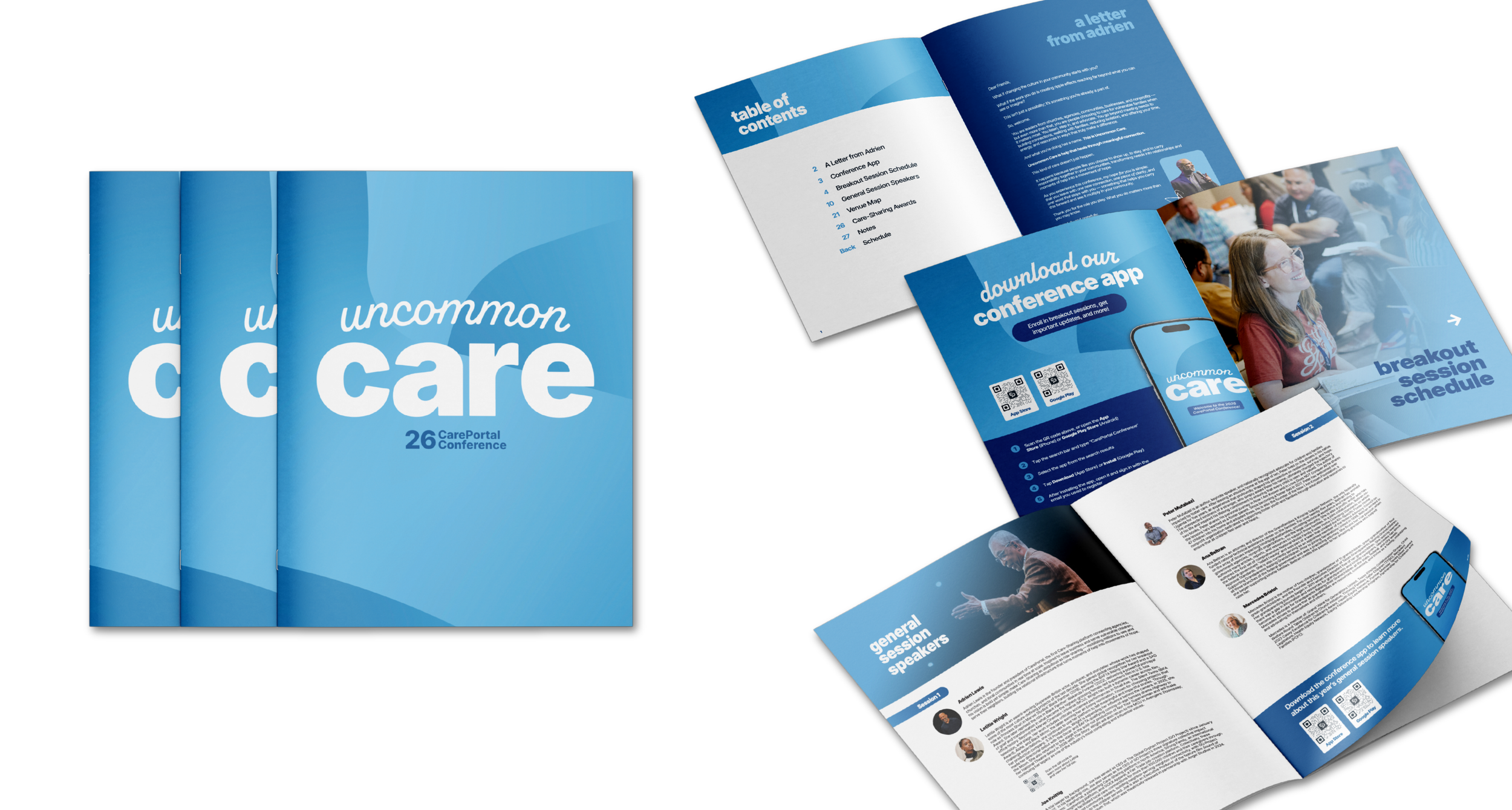
36-page program that had all the information attendees would need, including breakout session schedules, conference app info, and detailed maps of the venue.
Printed by J&J Printing.
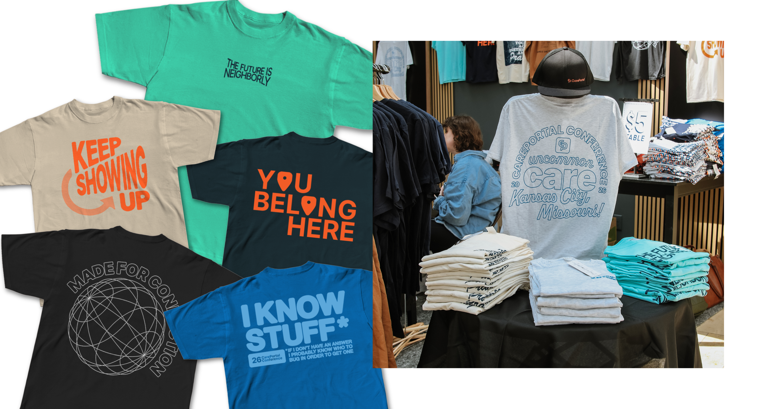
Apparel collection created for the conference, centered on themes of belonging and encouragement.
Printed by GOEX Apparel.
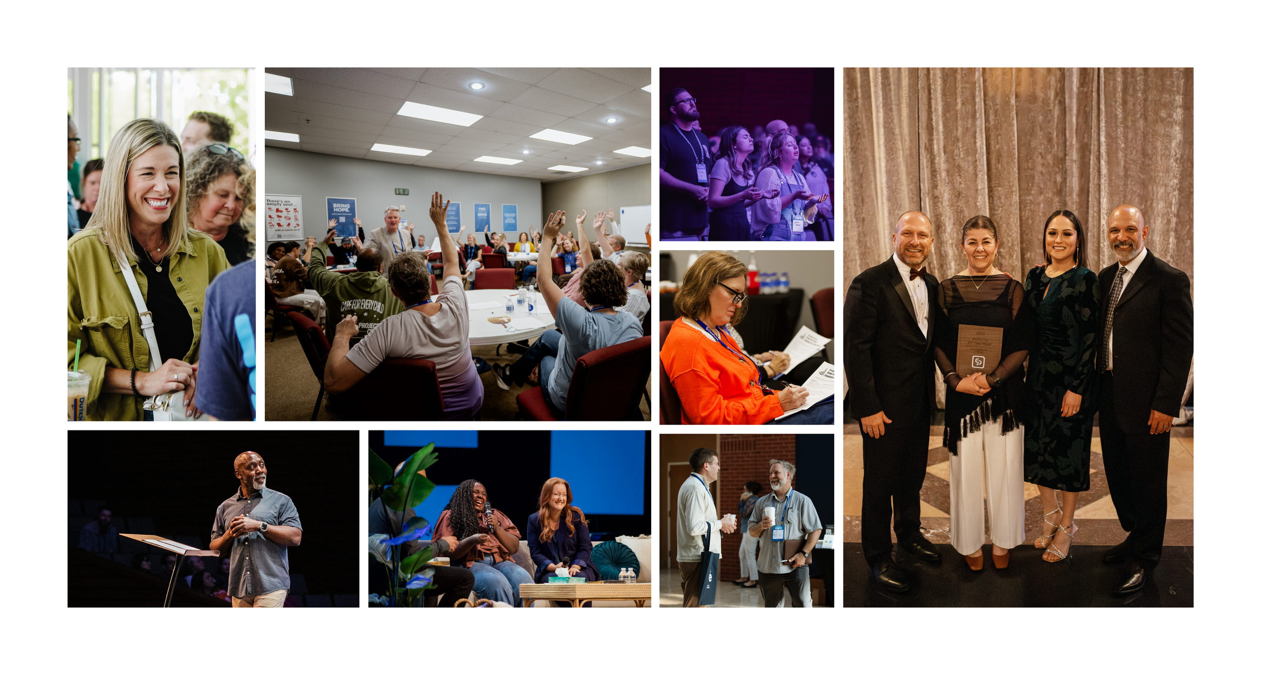
I led the photography coverage of the 3-day conference, which ranged from posed formal award ceremony shots to candid attendee moments.